


Tailwind and a Todo App: Working with Utility Classes
Where Tailwind speeds up UI development and where it makes code harder to read
I used to be pretty skeptical about Tailwind.
It felt like utility classes only made JSX harder to read: instead of neat CSS or an SCSS module, you get a long className string that you have to mentally parse while reading the code. I had also heard from colleagues, and suspected myself, that utility classes would be harder to debug: instead of one meaningful component name in DevTools, you get dozens of scattered classes.
I was used to CSS Modules, BEM, and a clean separation between markup and styling. So for a long time I did not see much reason to switch to Tailwind.
Then I decided to just try it.
And I ended up with a fairly simple conclusion: Tailwind is not a replacement for all CSS, but for small and mid-sized projects it really is a convenient tool. At the same time, some of my original concerns did turn out to be real, just not critical.
Why I Still Gave It a Chance
I would not say all the doubts disappeared, but a few things genuinely clicked.
The first thing I liked was that utility classes create a shared language for UI.
Grids, flex layouts, spacing, colors, and sizing no longer require your own helper classes like .flex-center, .mt-lg, or .u-cols-3.
Instead, you write this:
className = "grid grid-cols-3 gap-6";
And it does not matter who wrote the code, most developers immediately understand what it does.
The second thing is that the context lives next to the markup.
You open a .tsx file and immediately see both the structure and the styling. There is no need to jump between the file and styles.module.css just to understand how the element is supposed to look.
That turned out to be convenient for AI-assisted work too. The model does not need to go looking for related CSS files before it can understand how the interface is styled.
The third thing is that ready-made solutions are easier to move between projects.
Many modern libraries and templates use Tailwind. If you need to quickly assemble something like a card or a form, it is often enough to take an existing structure and adapt it to your project.
What I Built
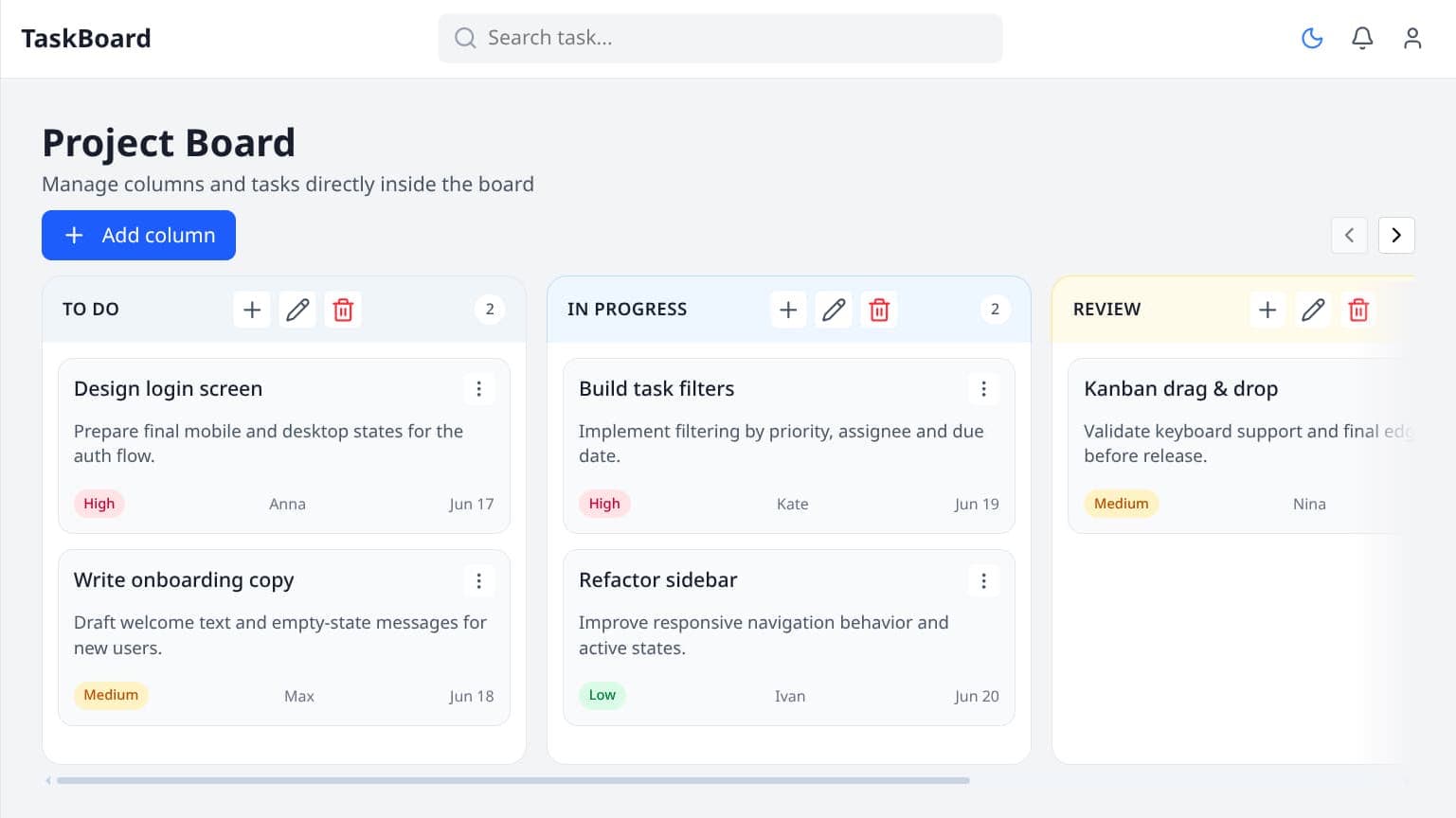
As an experiment, I built a frontend SPA for a todo app.
Stack:
- React 19 + TypeScript + Vite
- React Router with lazy-loaded pages
- Redux Toolkit + RTK Query
- MSW + local mock API
- Tailwind CSS v4
- class-variance-authority + tailwind-merge
- GSAP for potential animations
The architecture is split into layers:
app
pages
widgets
features
entities
shared
It is not a perfect FSD implementation, but the structure already makes it possible to separate responsibilities across the app in a reasonable way.
Where Tailwind Actually Helped
Fast interface assembly.
Tailwind worked especially well for layout, responsive behavior, and small UI elements.
Styles close to the markup.
For simple UI blocks, this is genuinely convenient: there is no need to create a separate styles file for a handful of properties.
UI variants.
Together with cva, it became convenient to describe different states and UI variants:
ButtonTaskColumnTabs
For example, instead of scattering a lot of conditional classes around the JSX, you can centralize variants through cva.
Dark mode.
dark: turned out to be a very convenient way to describe a dark theme directly next to the relevant style.
Fast development.
I was able to assemble the auth page fairly quickly, and the interface already looks coherent enough.
Where the Problems Started
The main drawback showed up in large JSX blocks.
For example:
src/pages/auth/ui/Page.tsxsrc/widgets/sidebar/ui/Sidebar.tsxsrc/App.tsx
When className starts containing dozens of utility classes, the JSX structure becomes less readable.
This becomes especially noticeable when you add many states and responsive variants:
className = "... md:... lg:... hover:... focus:...";
At some point you find yourself decoding the classes first and only then understanding the structure of the block itself.
Debugging became harder.
That turned out to be exactly the problem I was worried about from the start. When styles do not live in a separate file and only exist as a cluster of utility classes inside className, the element shows up in DevTools with dozens of classes instead of one meaningful name, and it is not immediately obvious which one is actually responsible for the bug.
Before, during a bugfix, it was enough to open Button.module.css and inspect all styles for that component in one place. Here, you either have to visually search for the right class among the rest or temporarily comment out part of className to understand what affects what.
This becomes even more noticeable together with cva: when variants are assembled dynamically, the final class list in the browser no longer matches the source code one to one, and you have to keep in your head how cva combines everything.
There is another problem too: inconsistent abstraction levels.
Some UI elements are already well organized through cva, while others still contain long class strings directly in JSX.
As a result, the project gradually starts mixing several different approaches to UI organization.
Final Take
After this project, my attitude toward Tailwind became more balanced, but not unconditional.
It really does speed up interface development, especially in small and mid-sized projects.
But it is not something you should use absolutely everywhere.
At this point I would stick to something like this:
- Simple styles and layout: utility classes.
- UI variants:
cva. - Complex visual blocks: split them out.
- If
classNamegets too large, rethink the structure of the block. - Do not be afraid of regular CSS where utility classes stop improving readability.
I still did not learn to love debugging utility classes. The habit of looking at a component's styles in one file has not gone away. But for layout and simple states, Tailwind really does save time, and for that I am willing to live with the DevTools friction.
For me, Tailwind ultimately turned out not to be a replacement for CSS, but just another tool.
And that is probably the most sensible way to treat it.